Project 1A – Charts and Graphs
Frequency Table and Histogram of Age Distribution for Beta Tech

|
Frequency
table for Age |
||
|
|
|
|
|
Upper limit |
Category |
Frequency |
|
20 |
<=20 |
1 |
|
25 |
20- 25 |
6 |
|
30 |
25- 30 |
7 |
|
35 |
30- 35 |
10 |
|
40 |
35- 40 |
6 |
|
45 |
40- 45 |
6 |
|
50 |
45- 50 |
7 |
|
55 |
50- 55 |
5 |
|
60 |
55- 60 |
3 |
|
|
>60 |
1 |
This above shown table and chart represents the age distribution (from 20 to 60) for a sample of employees from the Beta Tech data from the textbook.
- The objective is to see if there is an age distribution trend.
- The variables are frequency (number of people in a given range) and age (in years).
- The histogram shows that maximum numbers of employees are in the 30-35 age range.
- The chart/graph (Histogram for Age) shows that density of all the employees tend to be in the 25-50-age range, and employees younger and older than that age range occur less frequently.
Pie Chart of Age Distribution for Beta Tech
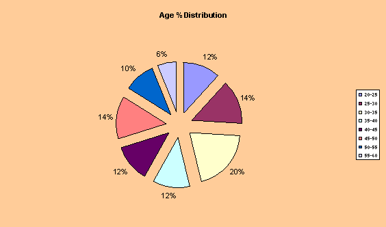
The above pie chart further shows the age distribution for Beta Tech.
- It represents the age ranges as a percentage of the total range.
- The variables are age ranges from a minimum of 20 to maximum of 60.
- The chart shows that there is a fairly even distribution from 20 to 55 with a peak in the 30-35-age range (20%) and minimum in the age range 55-60(6%).
Bar Chart of Gender Comparison for Beta Tech
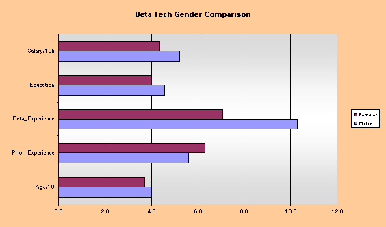
This chart compares male and female Salary, Education, Experience and Age
· The bar chart allow an easy visual comparison of data.
· Age is in 10’s of years and Salary is in ten thousands of dollar to allow the data to easily fit with in the chart. Education and experiences (both beta and prior) are measured in years.
· The values for males tend to be greater for every variable except Prior Experience.
Line Chart of Age and Salary for Beta Tech
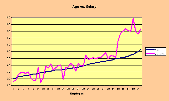
The above chart represents salary and age for each employee of Beta Tech in the sample set.
· The line chart is a simple way to represent trends and a relationship between age and salary.
· The variables are annual salary in thousands of dollars and age in years
· The chart shows a fairly positive relationship between age and salary. People’s salaries tend to increase as they age.
Scatter Plot of Age and Salary for Beta Tech
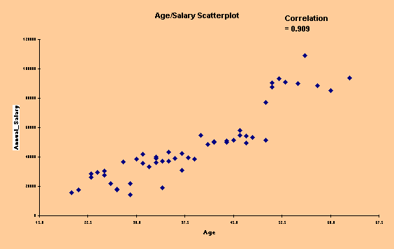
This chart represents the correlation between age and salary.
· The data is being summarized with a scatter plot because is quickly and clearly shows a trend between the two variables.
· The variables are annual salary in dollars, and age in years.
·
The graph represents a very strong positive relationship
between increasing age and increasing salary.
(The correlation of 0.909 is statistical proof of this.)